It takes two to ... pivot
In a lot of companies, there is much effort done to get rid of most Excel-related tasks. The company has bought an expensive BI tool and now every spreadsheet calculation needs to be done in the BI tool itself. From my point of view, this is, and will always be a utopia. Excel is a tool that is part of our business culture and to change that culture, you don't just force people to use a BI tool.
However, I do believe that you can evolve to a scenario where you use a BI tool more often than Excel, but this requires a culture change as well. Luckily in Power BI, this gap between the tool and Excel is made smaller and I have the feeling business adapts more rapidly to Power BI than any other BI tool because of its appearance. (it does resemble Excel, a little bit, right?)
This culture change always involves certain phases like the perception of the new tool and whether it can do what we want it to do, without the fancy demos. And for a BI tool to be able to work with Excel, only encourages the fact to use the BI tool on a more frequent basis.
Business case
I often come across projects where the source of the data is populated in Excel. These files could be maintained internally, but can also come from third parties. When working with the latter, it is often difficult to ask for changes to the file's structure, as the third party does not want to change it for all their customers and if they do, it will cost money.
For my own personal project and this particular case, I pretended that I could not change anything to the file's structure and tried to make it as dynamic as possible. For this project, I used Power Query, which is the transforming module that is part of the Power BI Desktop tool.
Step 1: Take a look at the file
The first thing that you will always need to do when working with data, is to look at the source. In this case, it was an excel file containing multiple tabs, and the particular tab I was interested in, was a custom matrix table. (Click to enlarge)
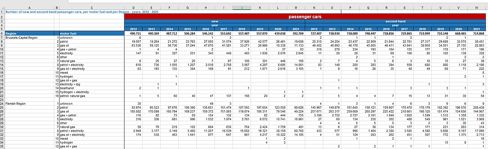
In the header area, we can read that it contains registration data about passenger cars for new and second-hand vehicles on a yearly basis. In the columns, we see that we can split the data per region and motor fuel.
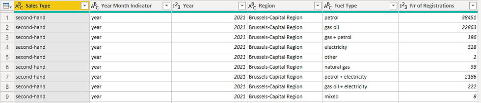
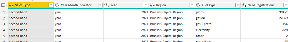
This format is not ideal, as I would like to end up with a table that looks like this:
Step 2: Slice and dice
The second step involves looking at the data you want to bring into Power BI and seeing which challenges come along. This way you can already prepare yourself on how to handle these challenges and see if Power Query is fit for the job.
Some challenges I found:
No real column headers: If we would use this as is in Power BI, we could not use it as we would like. Power BI loves to work with fact-like data, and this is the end result we would like to get. This hints that we are going to need to remove a lot of 'top rows' to get this table as clean as possible in our Power BI report.
Data with null values: There are a lot of blank values, and when looking at some data points, the attribute data is not always repeated, which hints that we will need to use the 'fill' option in Power Query.
Double trouble row: Data is split both on row and header level, whereas on the header level it is even split into two types (year and sales type). We are going to need a trick in Power Query to be able to transpose them correctly.
Step 3: The power of Power Query
The third and final step is to let Power Query handle it. Here you already have a list of the steps I have taken to get the data 'analytical' friendly:

Here are some explanations of the steps:
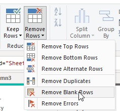
Filter out blank data rows:
So the first step I have done is to remove blank space. This can be done via clicking on the 'Remove rows' in the Home tab of power query:
Filled Down:
Next up is the fill down function, which we can use to fill down values, as we cannot link the data to a certain region/ year/ fuel type in this current format. The fill-down function can be found in the Transform tab of Power Query in the 'Any Column' section.


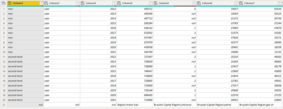
Transpose/ Pivot: As there were records that contained null values as well, but were linked to an attribute like sales type (new/ second-hand), I needed to use the transpose function to transpose the data and use the fill down function again on the necessary columns. Transposing is a very strong function in Power Query and always gives me the feeling I am transforming data. After the fill down function, I transposed the data back to its original format, with the difference that the data is filled in.
The result after the transpose:

Added Custom Key: When looking at the table above, I still don't have a nice-looking fact-like table that I can use to do my analysis. I needed to find a way to end up having a table with the following structure:
Region || Motor Fuel || Sales Type || Year || Value
The challenge here lies in the fact that I would need to unpivot the data somehow based on two attributes: Region and motor fuel. Power Query currently does not know how to do it based on two attributes, so that's why I decided to use some of my tricks:
Combine column Region and Motor fuel. I used a delimiter '|' to be able to split the data again afterward.
= Table.AddColumn(#"Transposed Table1", "Key Column", each [Column1]&"|"&[Column2])Transposed the data to achieve a table where the sales type are treated as records and the "Key Column" values are treated as columns.
Reversed the table, as the data labels existed at the bottom of the table.
Promoted the headers so that each header is a combination of Region and Motor Fuel
Unpivot the data with the sales type and year, which will provide a record per sales type, year, region, and motor fuel.

Clean up
The last steps involve a set of cleaning steps where I split the concatenated column again. With the help of the split command in Power Query, and with the custom delimiter, this is a piece of cake to do. I also deleted unnecessary numeric values in the Fuel Type column to keep the right values.
= Table.TransformColumns(#"Changed Type2", {{"Attribute.2", each Text.BeforeDelimiter(_, "_"), type text}})After renaming the column headers, let's take a look at the end result:
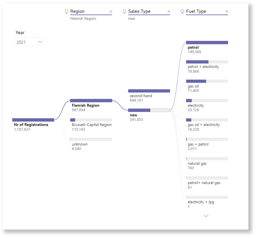
With the help of these transformations, it is really easy to create visuals in Power BI. With the drag and drop feature, you can click around and create the right visual for you. Here you can find some examples:
Stacked bar chart (100%)

Line chart

Decomposition tree
Conclusion
Even if your project consists of Excel sources, do not immediately write them off, as there are tons of possibilities in Power BI to make everything dynamic and to visualize data really easy. Take into account that each transformation you do is dynamic in the sense that as little effort as possible is needed to get to the end result, which is often a fact-like table that enables you to build fast visuals.
Comments